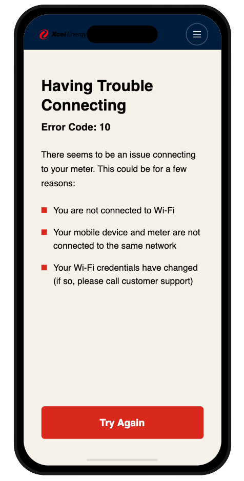
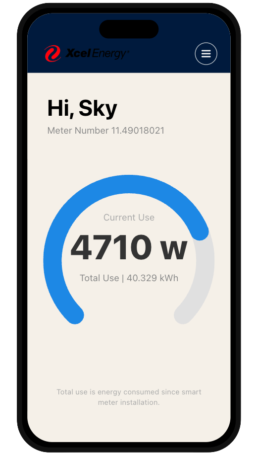
UX Redesign · Accenture × Xcel Energy

What does 4710 watts mean to you?

A smart meter app shipped under deadline pressure. It worked technically. Internally, the team described it as "only useful to super nerds." I came back to the data I once built, this time as a designer, to ask why.

Original My Energy Connection dashboard showing 4710 watts with no context
The Project

Xcel Energy partnered with Accenture to build My Energy Connection, a smart meter companion app giving customers real-time access to their energy data, fulfilling a regulatory commitment ahead of a Colorado meter rollout. I was embedded on the delivery team writing Python Lambda functions to expose meter data to the UI layer, managing database logic in PostgreSQL, and working across a delivery team of 15+ engineers and analysts.

My Role

Technical contributor → UX designer. I didn't design the original app. My role was backend: data exposure, system integration, API logic. This case study is the redesign I came back to do: using everything I knew about why the data exists the way it does to make it work for the person holding the phone.

The Problem

The MVP delivered raw meter readings, watts and kilowatt-hours, with no translation layer for non-technical users. Even stakeholders in internal review meetings asked "is that good or bad?" The app needed a v2 that served everyday customers, not just early adopters.

Original dashboard showing 4710 watts with no cost or benchmark context

Pain Point 01

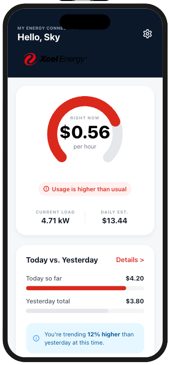
The dashboard spoke in numbers, not meaning.

Users saw "4710 w" with no frame of reference. The gauge had no scale, no benchmark, no cost translation. The only other metric, total use since smart meter installation, was meaningless to daily behavior. In an internal review meeting, a non-technical stakeholder asked directly: "Is that good or bad?" That question became the brief.

Original connection error screen listing technical causes with a single Try Again button

Pain Point 02

Errors told you what went wrong. Not what to do.

The connection error screen listed three possible causes as bullet points and offered one button: Try Again. Users had no path to resolution: just a list of things that might be wrong and a prompt to repeat the same action. Error states are where trust is built or broken. This one broke it.

Original setup checklist using technical system language

Pain Point 03

Setup spoke like a developer wrote it.

Five checklist steps used language written for the system, not the user. "Creating trusted ID for your mobile device." "Authorizing your device to meter." These steps described what was happening technically, but left customers with no sense of what it meant for them or how long it would take.

The redesign worked within a hard constraint: I could only use data the API already exposed. No new backend work. No new endpoints. Every decision had to be technically honest, which meant the design had to work harder to translate what already existed.

Before Original dashboard showing raw wattage
After Redesigned dashboard showing cost per hour and today vs yesterday comparison

Translate watts into dollars.

The redesigned dashboard leads with $0.56 per hour, a number anyone understands, derived from the same wattage reading the MVP already exposed. A today vs. yesterday comparison replaced the meaningless cumulative total. The status chip added emotional signal: "Usage is higher than usual." Same data. Completely different meaning.

Before Original error screen with error code and bullet list
After Redesigned error screen with plain language and two action paths

Turn a dead end into a next step.

The redesigned error state leads with the most likely cause in plain language, gives one specific action the user can take right now, and adds a secondary path to support. The error code is gone. The bullet list is gone. What remains is: here's what happened, here's what to do, here's where to get help. Two buttons instead of one.

Before Original setup steps in technical language
After Redesigned setup with plain-language steps and reassurance

Make the wait feel human.

Five technical steps became five plain-language moments. "Creating trusted ID for your mobile device" became "Securing your connection." "Meter joining Wi-Fi network" became "Meeting your meter." The same five steps, rewritten from the user's perspective rather than the system's. The tone shifted from status log to reassurance.

What this project shows

Being embedded in the engineering layer isn't separate from design: it's a competitive advantage. Understanding why the data exists the way it does, what the API can and can't expose, and what a firmware dependency means for a rollout timeline is exactly what makes design decisions technically honest. I didn't just redesign screens. I redesigned the translation layer between a complex system and the person holding the phone.

What I'd build next

The roadmap already anticipated the next features: appliance-level disaggregation, solar offset display for customers with panels, and peak-hour cost alerts. Each of these requires data the current API doesn't yet expose, but the design foundation is ready for them. The next version of this app doesn't need to be smarter. It needs to be more personal.

If conditions were different

With access to real user testing data, I would have validated the cost-per-hour translation with actual customers before shipping: specifically testing whether "$0.56/hr" creates the behavior change the business wanted, or whether a different framing (daily projection, monthly estimate) would land better. The redesign is grounded in logic and stakeholder feedback from the original project. User testing would have made it evidence-based.